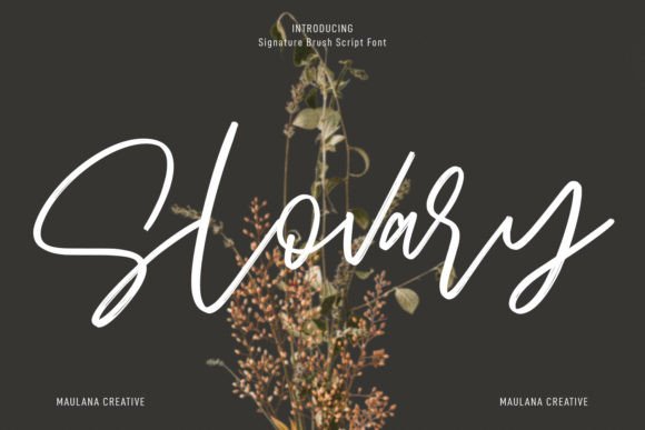
Slovary: A Refined Script Font for Digital Branding
As a UI designer who ships dozens of landing pages, SaaS dashboards, and e-commerce experiences each year, I treat fonts like foundational design assets—not just decoration. Slovary stands out in my font library not because it’s flashy, but because it’s intentionally crafted: a premium script font with tight letterfit, graceful entry/exit strokes, and consistent baseline rhythm. It doesn’t shout—it invites. And in digital interfaces where first impressions happen in under two seconds, that quiet confidence matters.
Slovary belongs to the Script Amp category—meaning it’s built for impact at larger sizes, not body copy. Its high level of detail shines in hero sections, logo lockups, and branded banners. Each glyph balances organic flow with structural clarity: subtle variations in stroke weight, carefully tuned kerning pairs, and open counters that prevent visual crowding—even on 1440p desktops or iPad Pro screens. That precision translates directly into readability during quick scanning, especially when used over high-contrast backgrounds or semi-transparent overlays.
In practice, Slovary excels where tone and trust intersect. A boutique skincare brand uses it for its “Handcrafted Since 2012” headline—soft enough to feel artisanal, sharp enough to read instantly. A leadership coaching site deploys it in the sticky navigation bar’s logo text, pairing it with Inter for all body copy and interface labels. The contrast works: Slovary sets the emotional temperature; the sans serif delivers clarity and speed. No cognitive load, no ambiguity—just intentional hierarchy.
It’s not ideal for long paragraphs, small CTAs, or dense mobile menus. But as a display font? Exceptional. Use it for:
- Hero section headlines (minimum 36px on desktop, 28px on mobile)
- Section dividers (“Our Process”, “Client Stories”, “What You’ll Learn”)
- Logo text and favicon typography (when exported as SVG with clean outlines)
- Animated text reveals in product walkthroughs or course sales pages
- Branded social media banners and email header graphics
For responsive layouts, test Slovary at breakpoints—not just size, but spacing. On smaller viewports, increase letter-spacing by 2–4% to preserve legibility. Avoid stacking it over busy image backgrounds without a subtle text shadow or solid overlay. On dark mode, use a crisp white or light cream (#F8F7F5) rather than pure white (#FFFFFF) to reduce glare and maintain warmth.
Font pairing is where Slovary reveals its versatility. Pair it with a neutral sans serif like Inter, Manrope, or IBM Plex Sans for modern digital products—or go editorial with a warm serif like Cormorant Garamond or Lora for blogs, newsletters, and content-heavy portfolio sites. Avoid competing scripts or overly decorative typefaces: Slovary needs breathing room to communicate elegance, not clutter.
Commercial use is straightforward—but essential to verify. Slovary includes WOFF2 and WOFF webfont files, full Latin character support (including accented characters for French, Spanish, and German), and stylistic alternates via OpenType features. No variable weight axis, but it ships with one refined weight optimized for display. For client work, SaaS platforms, or online stores, ensure your license covers web embedding, template resale, and multi-domain usage. Most reputable foundries offer tiered licenses—choose one that matches your deployment scale, not just your current project.
Think of Slovary as your brand’s signature—written once, remembered across touchpoints. It performs well in Figma auto-layout components, renders cleanly in CSS @font-face declarations, and exports crisply from design tools for handoff. I’ve used it in Shopify themes where the font loads before the main content, thanks to proper preload hints and font-display: swap. No FOIT, no FOUT—just smooth, confident presence.
Its personality sits between timeless and contemporary: not so formal that it feels archival, not so casual that it undermines authority. That balance makes it ideal for creative entrepreneurs launching courses, designers building personal portfolios, or founders refining their digital brand kit. A wellness app uses Slovary for its “Breathe With Us” onboarding screen—immediately signaling calm intentionality. A stationery brand uses it on product cards alongside minimalist sans-serif pricing—creating contrast without contradiction.
Importantly, Slovary avoids the pitfalls of many script fonts: no excessive ligatures that break on CMS editors, no inconsistent x-heights that misalign in flexbox containers, and no fragile terminals that pixelate below 24px. It’s engineered for the web—not just print or static mockups. When you export a Slovary headline as an SVG for a hero background, it scales infinitely. When you apply it to a button hover state with a subtle transform, it holds its shape. That reliability saves hours in QA and developer handoff.
If your current script font feels either too stiff or too unruly, Slovary offers a middle path: human-centered, technically sound, and quietly distinctive. It doesn’t try to be everything—it knows its role. And in digital design, where every pixel serves a purpose, that focus is rare. Whether you’re refreshing a decade-old brand site or launching a new digital product, Slovary earns its place not as a trend, but as a tool—one that supports your users’ understanding while reinforcing your brand’s voice, consistently and respectfully.