Humbly: A Playful Handwritten Typeface for Digital Branding
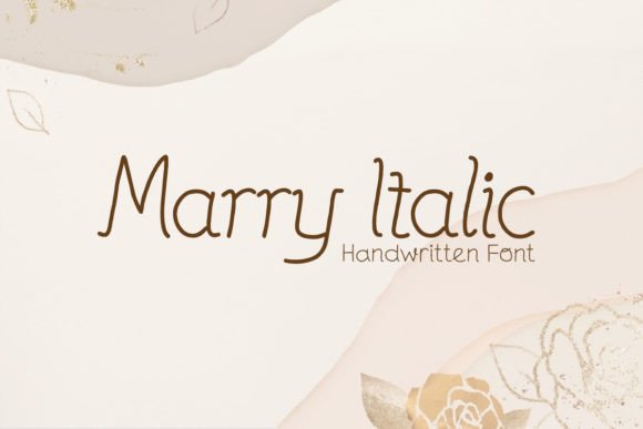
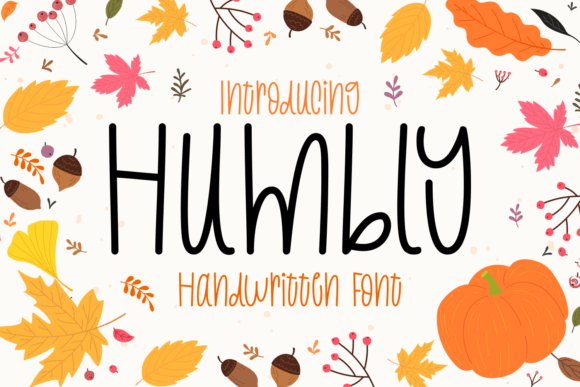
As a UI designer who ships landing pages, SaaS dashboards, and e-commerce experiences, I’m selective about script fonts. Too many feel forced, overly ornate, or break down at small sizes—especially on mobile. That’s why Humbly stands out: it’s a clean handwritten typeface with thin lines and a gentle, intentional whimsy that lands softly—not loudly. It doesn’t shout “hand-drawn!”; it whispers warmth, approachability, and creative confidence. And crucially, it works where most script fonts fail: in real web layouts.
Humbly belongs to the Script Amp category—a refined subset of script fonts built for impact without sacrificing legibility. Its letterforms are open, slightly bouncy, and carefully spaced. There’s no aggressive slant or exaggerated flourishes—just subtle rhythm and organic flow. That restraint makes it surprisingly versatile across digital touchpoints: hero headlines, section dividers, CTA buttons, product packaging mockups, course title cards, and even micro-interactions like hover states or animated text reveals.
For visual hierarchy, Humbly shines brightest at scale. Use it for hero titles (32–64px on desktop, 28–48px on mobile) paired with a neutral sans serif like Inter or Manrope for body copy. The contrast between Humbly’s delicate energy and crisp functional typography creates instant breathing room—and signals tone before users read a word. On a coaching website, pairing Humbly with a light-weight sans serif reinforces empathy and clarity. On a boutique online store, it adds artisanal charm without undermining trust or scannability.
It’s not ideal for long paragraphs or dense interface labels—but that’s by design. Humbly is a display font, not a workhorse. Think of it as your brand’s voice in key moments: the “Welcome” in a newsletter header, the “You’ve got this!” in an onboarding flow, the tagline overlaying a lifestyle image on a portfolio site. Its thin strokes render cleanly on Retina displays, and its consistent x-height ensures stable alignment—even when used alongside uppercase sans serifs or geometric headers.
Readability holds up well across contexts—if you respect its limits. On light backgrounds, Humbly performs reliably at 24px and above. Over dark or textured image overlays, boost contrast with a subtle white stroke or soft drop shadow (via CSS text-shadow). Avoid using it under 20px on mobile—especially in buttons. Instead, apply it to button labels only when space allows generous padding and clear visual weight (e.g., “Join the Circle” instead of “Sign Up”). For smaller interactive elements, keep body text and CTAs in your supporting sans serif—and let Humbly elevate the surrounding context.
Font pairing is where Humbly becomes strategic. Its personality thrives in contrast. Pair it with a humanist sans serif (like Poppins or Lato) for friendly digital products, or a warm serif (such as Cormorant Garamond) for editorial or course-based sites aiming for thoughtful authority. Avoid pairing with other scripts or overly decorative fonts—they compete rather than complement. In a brand kit, Humbly often anchors the “voice” layer: logo lockups, social banners, email headers—while your system font handles navigation, forms, and data tables.
Humbly includes standard OpenType features and supports Latin-based languages. It’s available in webfont formats (WOFF2 optimized), making it production-ready for modern sites. Check if your license includes variable font support or stylistic alternates—some versions offer subtle swash options for initial caps or custom ligatures, useful for hero graphics or branded PDFs. Always verify multilingual coverage if your audience spans Spanish, French, or Portuguese markets.
Licensing matters—especially for digital creators shipping templates or client sites. Humbly is a commercial font, meaning a single purchase typically covers web use on one domain, with extended licenses needed for SaaS platforms, white-labeled tools, or digital asset marketplaces. If you’re building a Notion template, Figma UI kit, or Shopify theme for resale, confirm whether your license permits redistribution. Most reputable vendors provide clear tiered licensing—so review terms before embedding in production builds.
In practice, Humbly strengthens brand identity through consistency—not repetition. A children’s learning app uses it for lesson titles and achievement badges, while keeping all UI labels in a rounded sans. A sustainable skincare brand applies it to ingredient story headers and limited-edition packaging previews—never on regulatory text or checkout fields. A freelance designer’s portfolio uses Humbly exclusively for the name in the navigation bar and project category tags, letting the rest of the layout breathe in clean, neutral typography.
What makes Humbly effective isn’t just how it looks—it’s how it behaves. It doesn’t distract from content; it invites attention *to* it. It doesn’t sacrifice usability for charm; it balances both. And unlike many playful handwritten fonts, it avoids looking like a trend—it feels timeless because it’s grounded in proportion, spacing, and purpose.
If your digital product needs warmth without informality, distinction without distraction, or brand personality without pretense, Humbly delivers with quiet precision. It’s not the default choice—but for the right moment, the right headline, the right human connection, it’s the only one that fits.